
13 Ways to Get Your Summer Thrills in Tasmania
Make the most of the longer days this summer with adrenaline-fueled adventures and nature-rich experiences, right on your doorstep.
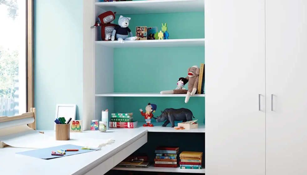
Spring in Tasmania is an ideal time to paint your house – temperatures are mild, humidity is moderate, and moods are on the upswing. So, if you’ve been meaning to give your house a facelift, now is the time to get on it.
Before you reach for a brush, you need to decide on a colour palette. With literally thousands of options to choose from, it can be challenging. Some have bizarre names too, which can make things even more confusing. Do you want to paint your house in ‘dead salmon’, ‘snugglepus’, or ‘nacho cheese’? Probably not from the sounds of it, but how would you know, it might be just the colour you’re looking for.
Finding Your Colour: Style, Light, and Space Choosing colours can be overwhelming, so consider what you know and like. What sort of styles catch your eye on Pinterest or in magazines? Do you gravitate towards beach house, mountain lodge, or cottage core? Starting with your personal taste is a good place to build from. It’s also important to think about how lighting plays into your choice. Different types of light – cool and warm light – bring out different qualities in paint colours.
Taking it inside, lighter shades make spaces feel larger and more open, while darker colours can create a cosy, intimate vibe – but can be suffocating if overdone. If you’re working with small rooms, whites, pastels, and soft neutrals make it feel larger and brighter. Larger rooms can benefit from darker colours that add depth and cosiness.
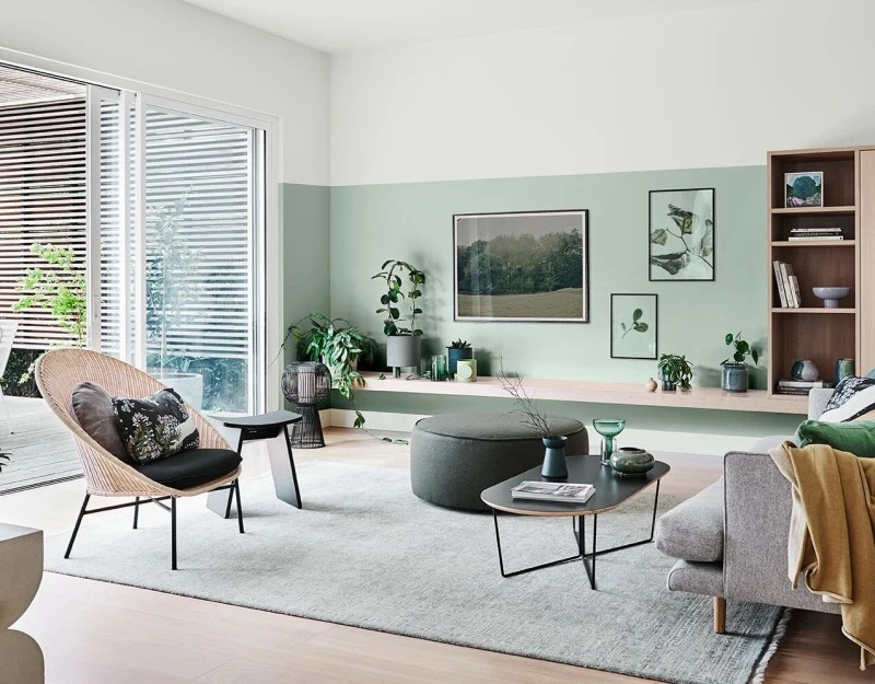
How Colours Make Us Feel Despite being smart, self-aware creatures, we humans can be susceptible to the influence of colour. They affect our mood and how we experience a space. That’s why certain colours are used strategically in marketing and branding to make us feel a certain way. Blues and greens create a sense of calm so are good for rooms you spend a lot of time in. Yellow is associated with happiness and energy but can be a bit much, so it’s best used sparingly in places like bathrooms, laundries, and kitchens. Pinks can inspire creativity (perfect for a home office), and reds are energising but suited for low light areas because they can also be stressful.
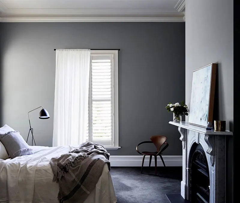
The 60-30-10 Rule A great colour scheme can bring your whole home together. One simple way to approach working out how much colour and where is the 60-30-10 rule. Use 60 percent of your dominant colour (usually on walls), 30 percent of a secondary colour (furniture, rugs), and 10 percent of an accent colour (accessories, artwork).
Tried-and-True Colour Schemes Popular exterior schemes tend to be a safe balance between soft whites and greys with darker greys and charcoals. Dulux White on White trims with Grey Pail walls make for a clean, suburban classic. Vivid White trims paired with Tranquil Retreat and a Colorbond Monument roof gives a timeless, elegant look. For something bolder, try an Italian Clay front door, Ancient Ruin on the exterior walls, and a Guild Grey fence for warmth and character.

As for interiors, soft blues, greens, greys and warm whites create a calm, sophisticated atmosphere. Timeless Grey walls with Natural White trim are a safe and stylish choice. Deeper green tones like Powdered Gum can add drama, and look great when softened with a pastel like Whisper White. For a fun, creative vibe, ideal for kids’ rooms, try pops of colour like Surf Wash and Shimmer Quarter blues, balanced with a clean white like Lexicon Quarter. If you’re unsure, it’s worth having a chat with a colour consultant. Other paint brands such as Porters Paints, Taubmans and Haymes are popular, and you can get valuable advice through local paint centres and hardware stores.
A Fresh Start Whether you’re refreshing the house for yourself or putting it up for sale (a new paint job can boost your property’s value), painting is a satisfying, worthwhile project. Done right, it can completely transform how your home looks and feels.

Stay up to date with everything happening at the Hobart Magazine.